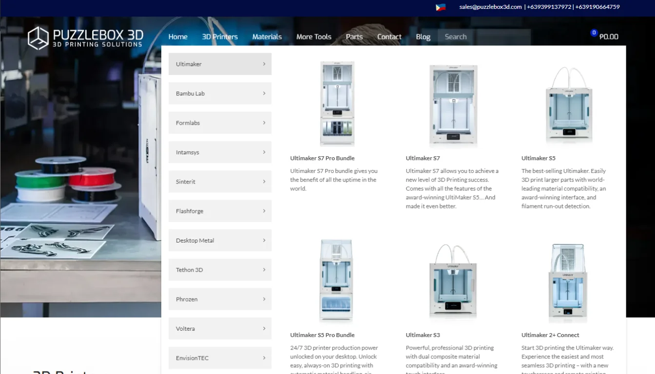
How We Design Websites – The Art of Familiar Efficiency
When designing websites, particularly for businesses focused on conversion, there's wisdom in the adage, "If it ain't broke, don't fix it." Here's why sticking to a standard layout isn't just about avoiding change; it's about leveraging user expectations for maximum efficiency.

1. Cognitive Ease: The Foundation of User-Friendly Design
The Familiar Layout Advantage
Predictable Navigation
By placing the logo on the top left and the menu on the right, we tap into users' existing knowledge of web layouts. This predictability reduces learning time, allowing users to focus on content rather than navigation.
- Mobile Adaptation: On mobile, this layout transforms intuitively. The logo remains prominent, and the menu, though collapsed into a hamburger icon, retains its position, ensuring a seamless transition from desktop to mobile.
Above the Fold
The prime real estate of any webpage, where key messages and calls to action must reside. Here, we introduce what the site offers and engage users immediately, encouraging deeper exploration. What users see first should communicate the essence of your site. This area should be a microcosm of the entire site's value proposition.
Homepage Structure
- Mirroring the Menu: Each section of the homepage acts as an appetizer for the full course found in the corresponding menu item. This not only aids in navigation but also in setting user expectations.
- Snippet Strategy: By providing just enough information to entice, each homepage section should intrigue and inform, leading naturally to the full-page content.
Conversion Pathways:
CTAs in Expected Places: Placing calls to action where users instinctively look increases the likelihood of interaction. The upper right corner or centrally above the fold are prime locations. Utilize design elements like color contrasts, directional cues, and whitespace to lead the user's gaze through the conversion funnel without feeling forced.
Accessibility as Standard:
- Universal Design: A layout that feels familiar also tends to be more accessible. Consistency in design aids those using assistive technologies, making your site inclusive by default.
By leveraging these principles, we design not just for aesthetic appeal but for functionality and conversion, ensuring that our websites serve their primary purpose effectively while maintaining user satisfaction.

2. Mobile Consistency: Ensuring Seamless User Experience Across Devices
The Importance of a Unified Experience
User Expectations
Today's users switch between devices seamlessly, expecting a consistent experience whether they're on a desktop, tablet, or smartphone. Mobile consistency ensures that your website's functionality, design, and content remain coherent, reducing friction in user interaction.
- Adaptable Design: While the layout might change to accommodate smaller screens, key elements like the logo placement, color scheme, and navigation structure should feel familiar. On mobile, the logo often remains top-left with a hamburger menu top-right, mirroring the desktop experience for intuitive use.
Responsive Design
- Fluid Grids and Images: Use percentages for widths rather than fixed pixels, allowing elements to resize relative to one another. Images should also scale to ensure they do not overflow their containing elements. CSS media queries allow for tailored stylesheets that adjust the layout based on device characteristics like screen width, ensuring readability and usability on any device.
Touch-Friendly Interactions
Ensure touch targets are appropriately sized for fingers, reducing errors and enhancing user comfort. Spacing between clickable elements is also crucial to prevent accidental taps.
Performance Optimization
Mobile users often face data limitations or slower connections. Optimizing images, leveraging browser caching, and minimizing code can significantly improve load times, which is critical for maintaining consistency in user experience.
Prioritized Content
Given the limited screen real estate, content must be prioritized.
- The mobile version should present the most essential information first, mirroring the importance of 'above the fold' content on desktops but adapted for vertical scrolling.
By focusing on these aspects, we ensure that mobile consistency isn't just about shrinking content to fit smaller screens but about providing an optimized, intuitive, and familiar experience that reflects the desktop version's core functionalities and aesthetics. This approach not only satisfies user expectations but also supports broader business goals like conversion rates and brand loyalty.

3. The Fold Still Matters
Maximizing the Prime Real Estate
First Impressions
The area of the webpage visible without scrolling, known as "above the fold" or the hero-banner, remains a critical space for capturing user attention. Here, the design must communicate the site's purpose, value, and call to action clearly. Place your most compelling content here. This includes your unique selling proposition (USP), primary CTA, and any critical navigation or branding elements like an attractive image that follows the theme or a related photo. The goal is to engage users immediately, encouraging them to explore further or take action right away.
Engagement Techniques
- High-Quality Visuals: Use images or videos that are not only high-quality but also relevant and engaging. Visuals should complement the text, providing a quick understanding of what you offer.
- Clear Headlines: Your main headline should be bold, clear, and concise, summarizing what users can expect from your site or what problem you solve for them.
Conversion Optimization
Positioning your main call to action here can significantly increase conversion rates. It should stand out but also feel like a natural next step for the user. If your CTA involves a form, keep it simple. Ask for only what's necessary to reduce friction. A name and email might be enough for initial engagement.
Dynamic Content
- Sliders and Carousels: While controversial, when used correctly, sliders can showcase multiple messages or products. However, they should be intuitive, with clear navigation controls, and not auto-rotate too quickly.
If feasible, personalize content above the fold based on user data or behavior, making the first impression even more impactful.
By strategically designing what appears above the fold, we not only cater to user expectations for immediate information but also set the stage for deeper engagement. This area of your website acts as both a welcome mat and a guide, leading users naturally into the content that lies below, all within the familiar framework that users have come to expect.

4. Homepage as a Menu Mirror: Streamlining User Navigation
Creating a Cohesive Site Structure
Previewing Content
The homepage serves as an overview or a directory of what the website offers. Each section on the homepage should act as a teaser or a snapshot of the detailed content found on the corresponding menu pages. Ensure that each homepage section visually and contextually matches the style and theme of the full page it represents. This not only aids in aesthetic continuity but also in cognitive recognition for the user.
Intuitive Navigation
Each section should link directly to its corresponding page or category, providing a clear path for users to follow. This reduces the steps needed to find detailed information, enhancing user satisfaction. Use icons, images, or short descriptions that reflect the content of the linked pages. These visual cues should be distinct yet harmonious with the overall design, making navigation intuitive.
Engagement Through Snippets:
- Tease with Content: Offer just enough information to pique interest. This could be in the form of key statistics, a compelling question, or a brief overview. The goal is to entice users to click through for more. Each section should end with or include a subtle call to action, encouraging exploration. Phrases like "Learn More," "Discover," or "See Details" can be effective.
Internal Linking
By mirroring the menu structure, you're also creating a robust internal linking strategy which can help with SEO. Search engines appreciate clear site architecture, which can improve page rankings. Use relevant keywords in these sections that align with the pages they link to, further reinforcing your site's SEO structure.
User Experience (UX) Design:
The transition from homepage sections to full pages should feel seamless. The design elements, tone, and information style should remain consistent, reducing any potential for user disorientation.
- Accessibility: Ensure that these navigational snippets are accessible, with proper alt text for images, and that they can be easily navigated via keyboard for those using assistive technologies.
By designing the homepage to mirror the menu, we not only simplify the navigation process but also create a thematic consistency that can enhance brand recognition and user trust. This approach ensures that users can quickly grasp the scope of what your site offers, making their journey from curiosity to conversion as smooth as possible.

5. Conversion-Oriented Design
Crafting the Path to Conversion
Call to Action (CTA) Placement
Position your main call to action where users naturally look first. Traditionally, this is the top right or centrally above the fold where it's immediately visible without scrolling. This placement leverages user habits, making the action you want them to take instantly accessible.
- Secondary CTAs: As users scroll, strategically place secondary CTAs that align with the content they're engaging with. These should feel like natural next steps in the user journey, perhaps offering more information, a demo, or a related product.
Visual Hierarchy
The most critical elements should be the largest. For instance, your value proposition or headline should dominate, followed by subheadings, body text, and then smaller details. This guides the user's attention from the most to least important information.
- Color Psychology: Use color to differentiate and highlight. A contrasting color for your CTA button can make it pop against the rest of your page, drawing the eye. However, ensure the color scheme aligns with your brand and doesn't overwhelm the user.
- Typography: Different fonts and weights can also establish a hierarchy. Bold or larger fonts for headings, regular for body text, and perhaps italic or light for less critical information or quotes. Consistency in typography helps in creating a smooth reading flow.
Whitespace
Let it Breathe: Whitespace, or negative space, isn't just empty space; it's a powerful design element. It helps in:
- Focusing Attention: By surrounding key elements like CTAs with whitespace, you isolate them from other content, making them stand out more effectively.
- Reducing Cognitive Load: A page cluttered with too many elements can overwhelm users. Whitespace gives the brain a visual rest, making the content more digestible.
- Improving Readability: Text surrounded by ample whitespace is easier to read. This not only applies to body text but also to headers and calls to action, making them more legible and thus more likely to be acted upon.
- Strategic Use: Use whitespace not just around the most important elements but also to separate different sections of content. This separation helps users process information in chunks, improving comprehension and retention.
By meticulously designing each element with conversion in mind, from where and how your CTAs are placed to the strategic use of whitespace, you create a pathway that not only guides users but gently nudges them towards making a decision. This approach respects the user's need for clarity and ease while strategically enhancing the probability of conversion.
Harmonizing Familiarity with Functionality in Website Design for Optimal User Engagement and Conversion
In crafting websites that convert, adhering to familiar layouts ensures cognitive ease, while mobile consistency guarantees a seamless user experience across devices. The strategic use of the fold maximizes initial engagement, and mirroring homepage content with menu structures simplifies navigation, enhancing user satisfaction and SEO. Conversion-oriented design, through careful CTA placement, visual hierarchy, and the intelligent use of whitespace, not only guides but also encourages users towards desired actions. Together, these principles form a cohesive strategy that respects user habits and expectations, optimizing for both usability and conversion without reinventing the wheel, proving that in web design, sometimes the most effective innovation is perfecting what's proven to work.

Ready to see these principles in action?
Explore our portfolio of expertly designed websites, where each site tells a story of user-centric design and conversion success.
